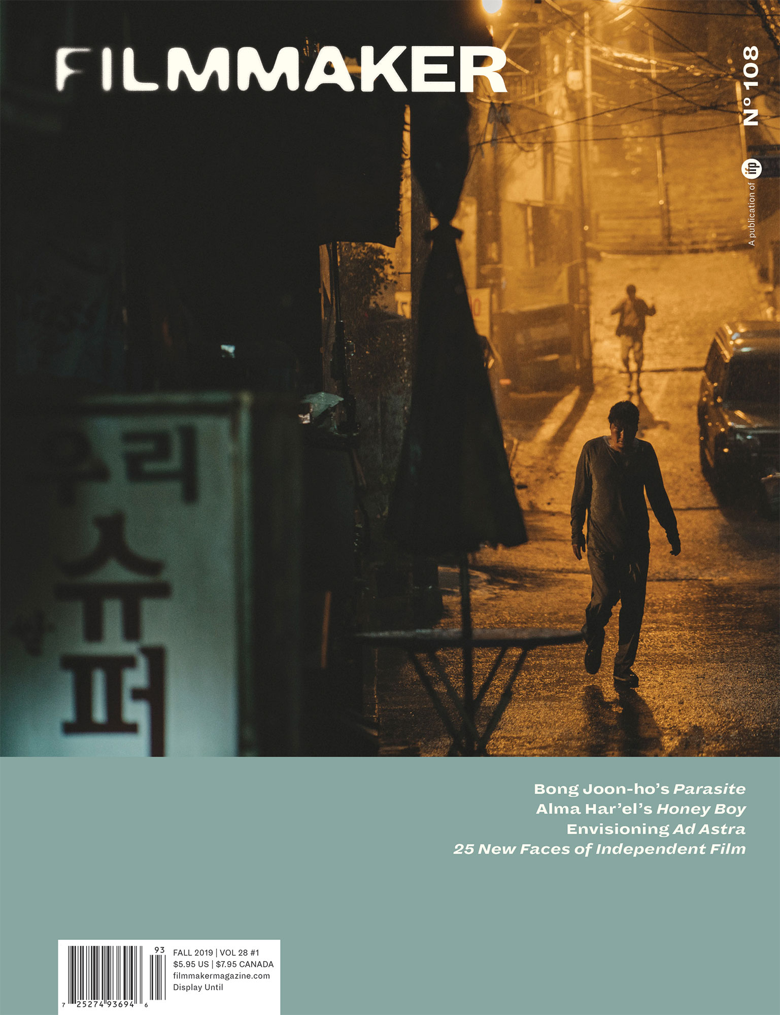
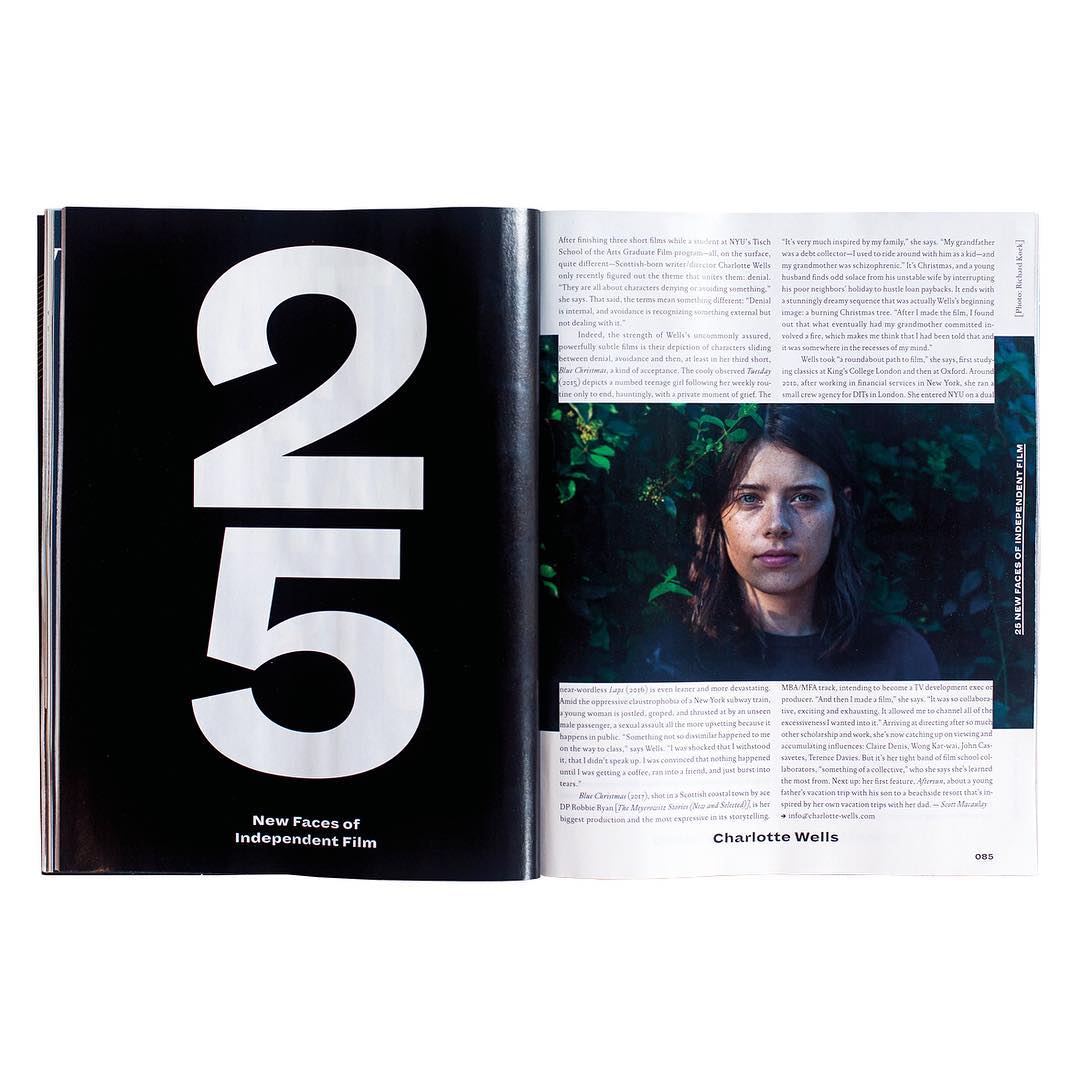
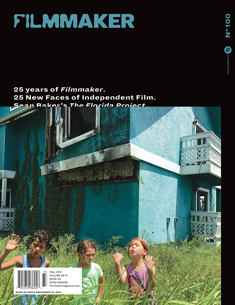
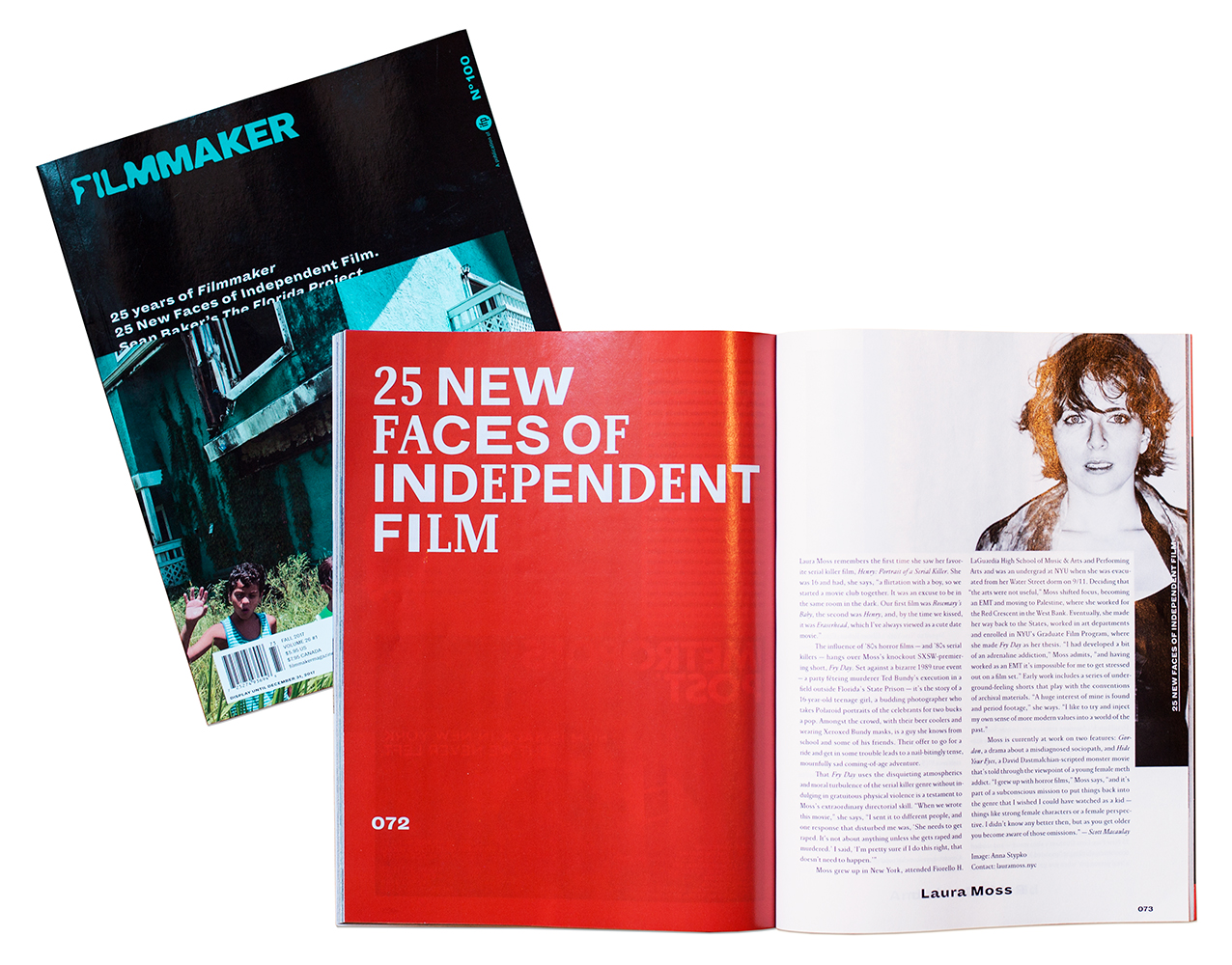
(v)
(v_i)
(version_industries)

business card
business card front
business card back
letterhead
compliment slip
_what
artwork from business cards through to compliment slips
_how
ric yerbury contacted us upon the recommendation of the essential essence. he was in the process of launching his new events company, rage events. within the umbrella of rage events ric wanted to focus particularly on 'the rage', a series of indoor and outdoor events governed by the seasons where ric would hire major bands (think wyclef jean or the flaming lips) to play along with smaller bands throughout the evening. all in all it was a very rock 'n' roll concept & we were asked to provide suitable branding materials in the form of a logo, stationery and other bits & pieces to fit the bill.
_link
www.rageevents.co.uk
_tags
home page
floorplans page
_what
website for the luxury israeli penthouse, crown opera.
_how
the tavivan sporn group wanted us to design an elegant, luxury website for a sea-side penthouse in israel. they sent us many photographs of the apartment and the surrounding area and briefed us on the general feel they were after for the site. we developed not just the logo and the overall site aesthetic but also composed a soothing atmospheric soundtrack for the site.
_features
  • html + javascript based interface
  • ipad compatible
  • contact form
  • original music
_link
seaopera-ph.com/en
_tags
_what
internal microsite for reader's digest international.
_how
the brief for this job came from brand communications firm, roth partners, who contacted us about translating their work on the reader's digest brand into an internal microsite. the site would serve to share new strategic work and brand tools with employees of reader's digest around the world. its goal was to deliver new brand materials in print and video formats in ways that would engage the internal brand audience and inspire them to review and learn from the content.

a key part of this site was stewarding viewers through the new work done for reader's digest and to that end we developed an innovative task-based system which broke up the different elements and took viewers through them one-by-one. critical to our design was achieving involvement and participation across disparate audiences. the result was more of an online study course than a classic static brochure-style site.
_features
  • fine-grained access control
  • html5 video
  • intuitive tasked learning flow
_tags
sparkler
traffic
bikers poster
max poster
boat poster
BAM festival poster
_what
website, posters + typography for the feature film, pavilion
_how
we were contacted by film director tim sutton after a series of talks we did on designing websites for films for the IFP. he was interested in us producing a website and possibly some film posters for his new film pavilion. we hit it off very quickly and soon had a series of ideas laid down for online and offline approaches to promoting the film.

the website focusses on a series of animated GIFs that reflect the very calm and subtle visual tone of the film, combined with looped audio from the films soundtrack + score. the posters take a leaf out of robert zemeckis's book to visually represent the very subtle narrative elements within the film.

we also handled the type treatment for the credits within the film. stay tuned for a fuller write-up of the process behind making these various elements.
_features
  • ipad / iphone compatible
  • html5 / javascript driven UI
  • animated GIFs / cinema graphs
  • scrollwheel / cursor key navigation
_link
pavilionfilm.com
_tags
apollonia
as if
betty
casino
diamond girl
headbanger
long island ice tea
peace out
space cadet
third base
_what
layouts work for the new york-based fashion house, house of jackie brown
_how
for the 2010 line of jackie brown's swimwear line we were asked to retouch a series of super raw shots taken in various locations around the city of new york and bring them inline with the company's overall aesthetic. the designs were used in both print + online campaigns.
_link
houseofjackieb.com/jungle_juice
_tags
poster
VHS
VHS 2
VHS + poster
_what
artwork for makeup and vanity set's film soundtrack, 88:88.
_how
this was a project that started out with MAVS sending us demos and whispering things about it possibly being a film soundtrack. we were then contacted by the film's director, joey ciccoline. joey showed us the film and sent some ideas he'd had for possible directions for the artwork. included in his package was a poster for the 1985 kid's science fiction film, the explorers. this poster single handedly informed the initial designs we created for the film soundtrack. these designs were then scrapped when joey then expressed interest more in a design that told you less about the narrative, and gave you simply a sense of mystery. 

fortunately MAVS then had the idea to do a parallel release in the form of a limited edition VHS cassette and poster. this would then come out later than the official film artwork, and give the original pieces we created a place to live. a tangent universe if you will.

you can see photos of the VHS tape here.
_link
8888film.com
_tags
single cover
_what
logo + artwork for german house duo, booka shade
_how
we were put in touch with booka shade through our work with big black delta. they were about to put out their first release through dim mak records, and were keen to start from scratch with their design aesthetic for this reason. they pitched us a few ideas, concepts and loose thoughts to push us in the right direction, and after hammering away at several different approaches we settled on a final logo device and treatment. it was a look that we felt kept elements of their geometric graphics of the past, but evolved and simplified things in an elegant fashion.

the first use of the logo you'll find on their forthcoming single 'honeyslave', which you can listen to snippets of here.
_link
bookashade.com
_tags
cassette cover
inside spread
_what
artwork for the protomen's cassette single, i drove all night.
_how
the first single from the protomen's forthcoming covers record was the roy orbison song, i drove all night. the song was of course chosen because of how directly it tied in with and expanded upon the band's long-running, conceptual narrative. in the same fashion the artwork had a very clear path to follow. once again employing the talents of john delucca, we set about creating a design that both expanded on the protomen's story, but also paid homage again to many of their key influences. releasing it on cassette only was of course the final gesture that completed the project.

if you're interested you can read more about the development of the artwork on our blog. otherwise by all means grab a copy of the single here, whilst stocks last.
_tags
_what
artwork for big black delta's single, side of the road.
_how
inspired by a salvador dali painting and discussions about how to evolve the BBD aesthetic as we approach the foot of the mountain that will eventually be the second LP, this cover is in some ways perhaps the band's most figurative yet. the human eye instinctively sees faces in abstract patterns, and of course it's no incident that that is what you might see here. however what you take from it as you listen to the song is of course your decision. either way we hope you enjoy the experience.
_link
bigblackdelta.com
_tags
EP cover
praxis single cover
_what
artwork for makeup and vanity set's EP, 7.25.2148.
_how
the team that now consists of makeup and vanity set, joey ciccoline and version industries is continuing its development into an increasingly cohesive whole. utilizing visuals originating with joey's video and 3D effects work, we've put together artwork for both the new EP and the leading single from it, praxis. the concepts behind it are echoed heavily within the music, so we won't spoil them for you here. just know that it's all part of a larger thought process building up to a satisfyingly complex full length album.
_link
makeupandvanityset.com
_tags
single cover
outside spread
_what
7" single artwork for the LA-based band, sonoio
_how
alessandro asked us to put together a sleeve for the 7 inch single release of his track 'scientist'. the artwork we created was an extension both visually and narratively from the elements we'd put together for the album from which the song came.

you can grab a copy of the single here.
_link
sonoio.org
_tags